Client: Ehden Aesthetics ( www.ehdenaesthetics.com )
Designer: Aesthetic Brands Studio, Adnan ( www.aestheticbrands.studio )
Project: Brand Identity Design, Style Guide, Ongoing Brand Support
Designer: Aesthetic Brands Studio, Adnan ( www.aestheticbrands.studio )
Project: Brand Identity Design, Style Guide, Ongoing Brand Support
Project Overview:
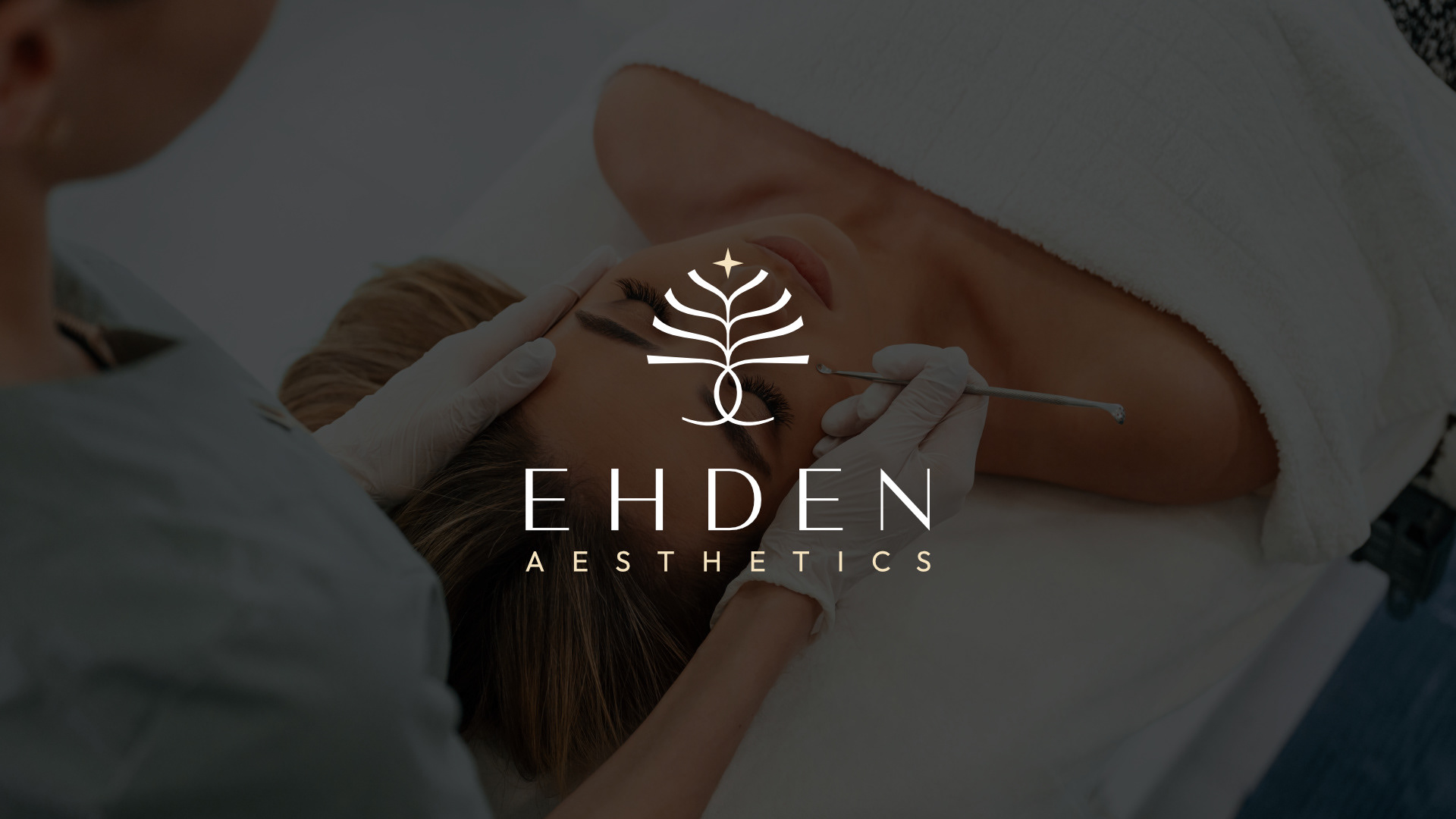
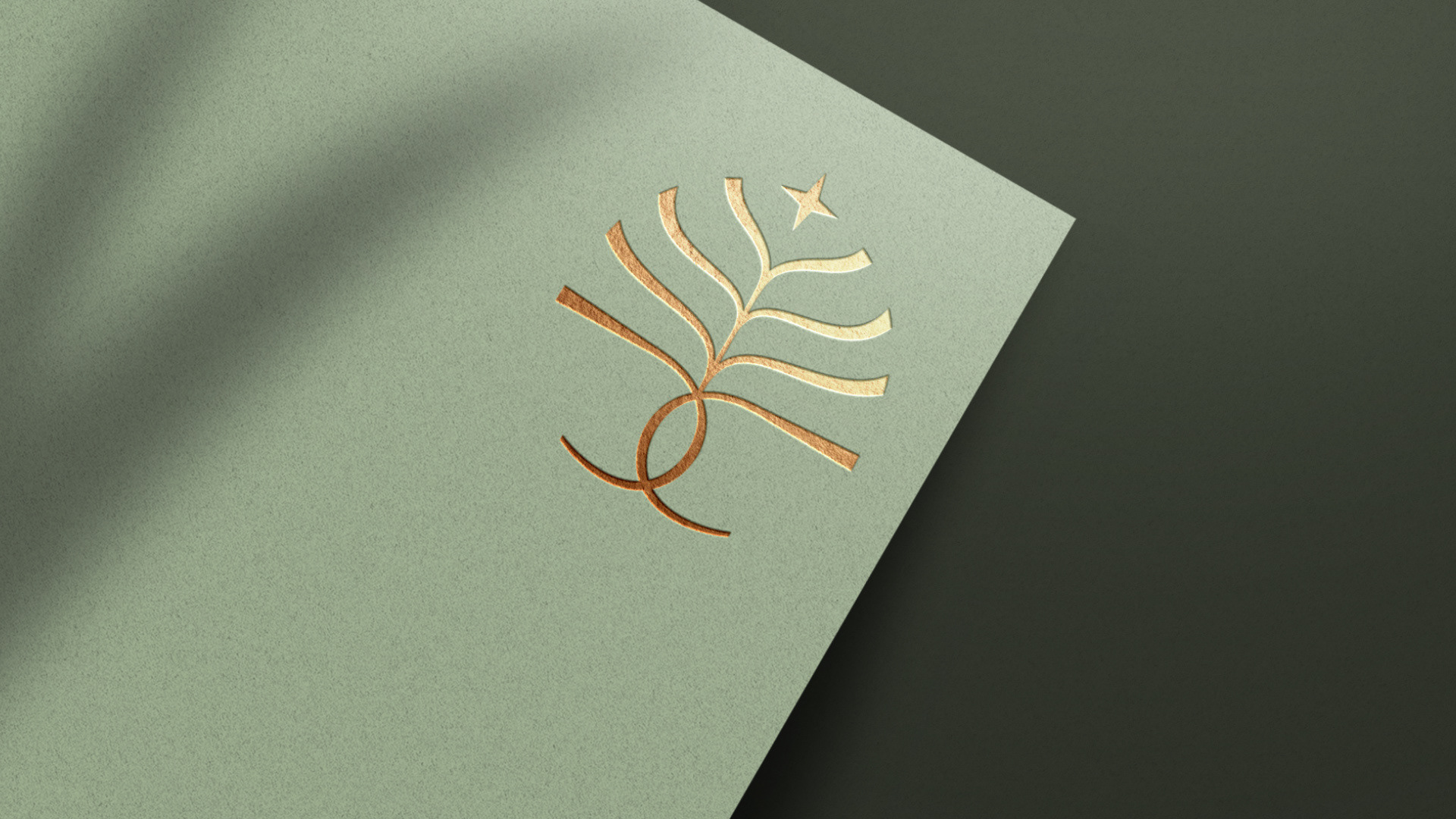
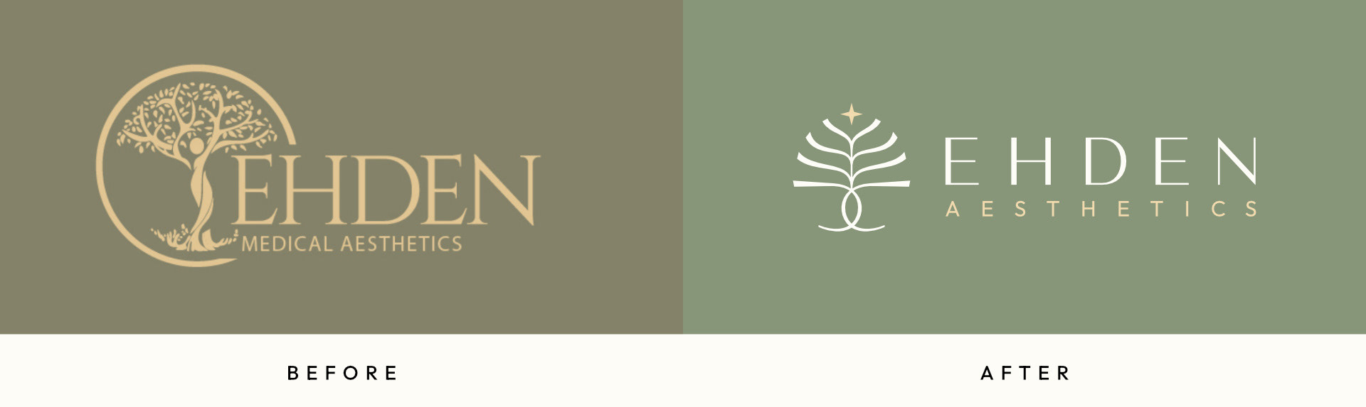
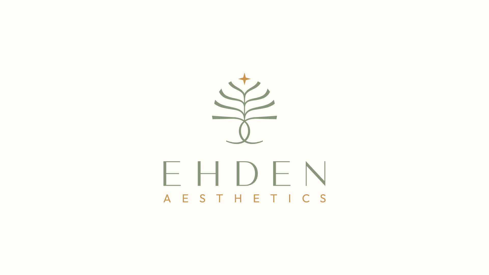
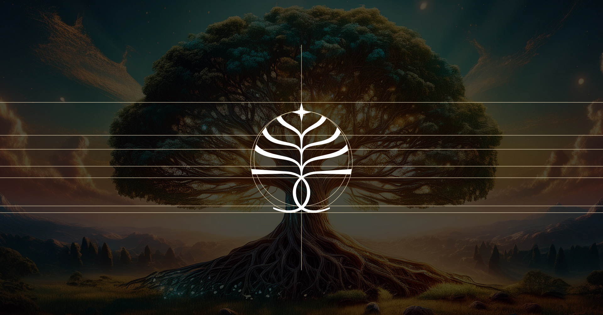
Our collaboration with Ehden Aesthetics focused on crafting a holistic brand identity that embodies tranquility, elegance, and professionalism. From logo design to typography and color schemes, every element was carefully curated to reflect a sense of paradise. The branding process began with extensive moodboarding to align with the brand’s vision and narrative. Inspired by the Tree of Life and the town of Ehden, the final design integrates a bespoke tree icon, symbolizing growth and renewal, crowned with a star to embody aspiration. The result is a luxurious, serene aesthetic that mirrors the client’s vision of offering a paradise-like experience.
Our collaboration with Ehden Aesthetics focused on crafting a holistic brand identity that embodies tranquility, elegance, and professionalism. From logo design to typography and color schemes, every element was carefully curated to reflect a sense of paradise. The branding process began with extensive moodboarding to align with the brand’s vision and narrative. Inspired by the Tree of Life and the town of Ehden, the final design integrates a bespoke tree icon, symbolizing growth and renewal, crowned with a star to embody aspiration. The result is a luxurious, serene aesthetic that mirrors the client’s vision of offering a paradise-like experience.
About the Client:
Ehden Aesthetics is a premier medspa offering a range of advanced aesthetic treatments. The clinic focuses on delivering high-quality, customized treatments in a serene environment. Led by Pascal, Patricia & Katie, Ehden Aesthetics draws inspiration from the founder’s hometown, bringing a unique blend of care, beauty, and nature into its client experience. Their services range from Botox and dermal fillers to skin rejuvenation, all aimed at helping clients feel their best while embracing natural beauty.
Ehden Aesthetics is a premier medspa offering a range of advanced aesthetic treatments. The clinic focuses on delivering high-quality, customized treatments in a serene environment. Led by Pascal, Patricia & Katie, Ehden Aesthetics draws inspiration from the founder’s hometown, bringing a unique blend of care, beauty, and nature into its client experience. Their services range from Botox and dermal fillers to skin rejuvenation, all aimed at helping clients feel their best while embracing natural beauty.
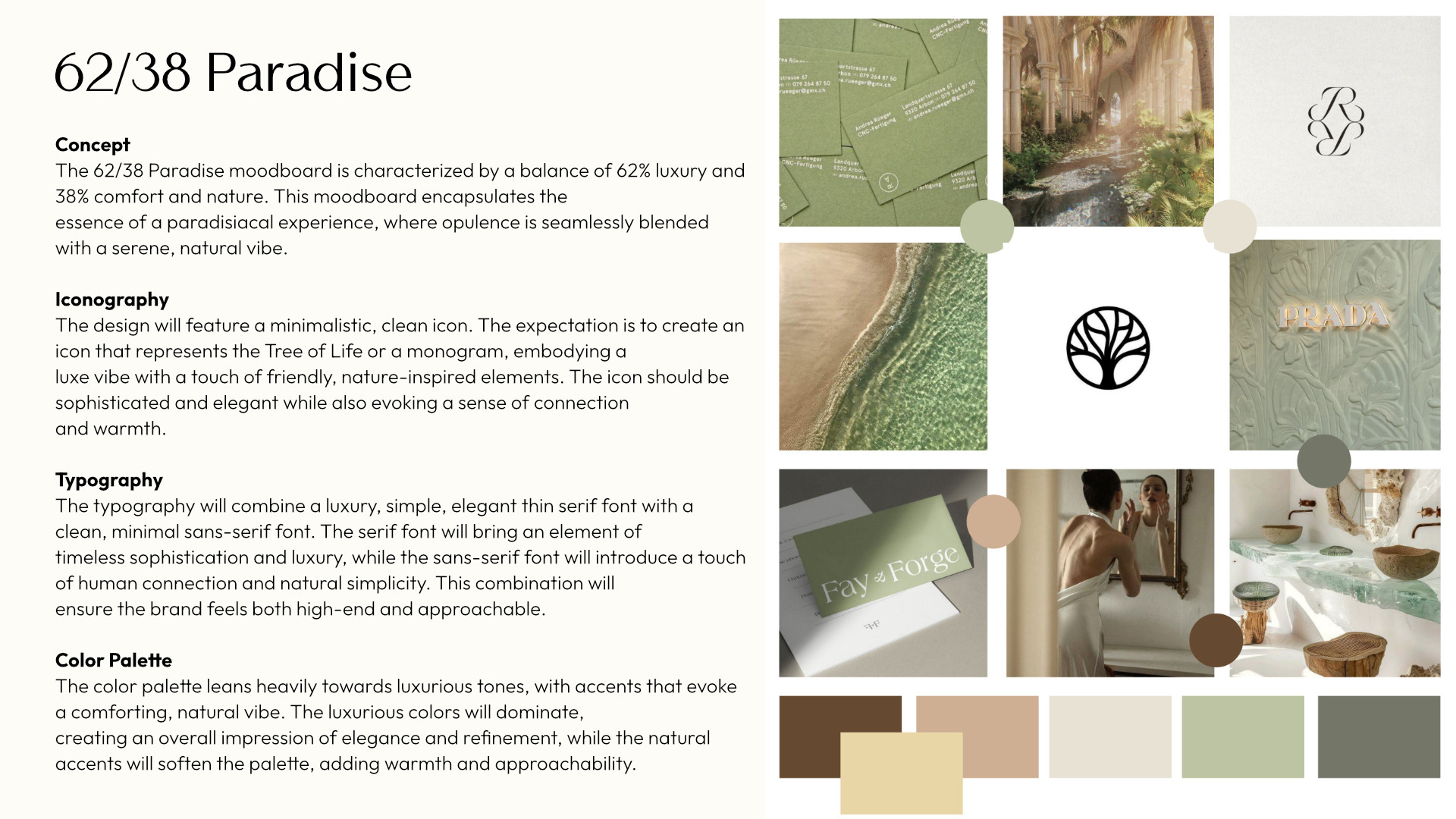
Moodboards:
We started the project with three moodboards to explore potential brand directions. The focus was to create a serene, inviting, and luxurious brand identity—something that would feel like a calming retreat. After reviewing the options with the client, we aligned on a concept that emphasized tranquility while preserving a high-end aesthetic.
We started the project with three moodboards to explore potential brand directions. The focus was to create a serene, inviting, and luxurious brand identity—something that would feel like a calming retreat. After reviewing the options with the client, we aligned on a concept that emphasized tranquility while preserving a high-end aesthetic.
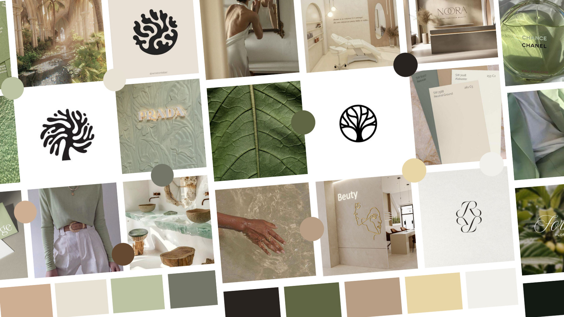
The key inspiration behind creating the moodboards and establishing balance was the golden ratio (Fibonacci Sequence). While precise measurements weren’t always feasible, we used intuition and interpretation to inform the brand's style, voice, and feel. Our aim was to create an experience that feels like a serene escape—a place where clients feel luxuriously cared for and genuinely welcomed, blending sophistication with an approachable warmth. The 62/38 concept.
The golden ratio, a principle often found in nature and art, is known for its ability to create visual and emotional harmony. This guided our approach to infuse Ehden Aesthetics with a balanced elegance and inviting aura, making every brand element—tone, look, and interaction—feel naturally cohesive and aligned with the brand’s purpose.
Logo Design & Brand Direction:
The client had an existing logo, but it didn’t capture the essence of their brand. We developed three new branding options, one of which was selected. Drawing inspiration from the Tree of Life, we incorporated it into the logo as a symbol of growth and renewal, reflecting the ethos of Ehden and the clinic’s mission to positively impact clients’ lives.
The client had an existing logo, but it didn’t capture the essence of their brand. We developed three new branding options, one of which was selected. Drawing inspiration from the Tree of Life, we incorporated it into the logo as a symbol of growth and renewal, reflecting the ethos of Ehden and the clinic’s mission to positively impact clients’ lives.
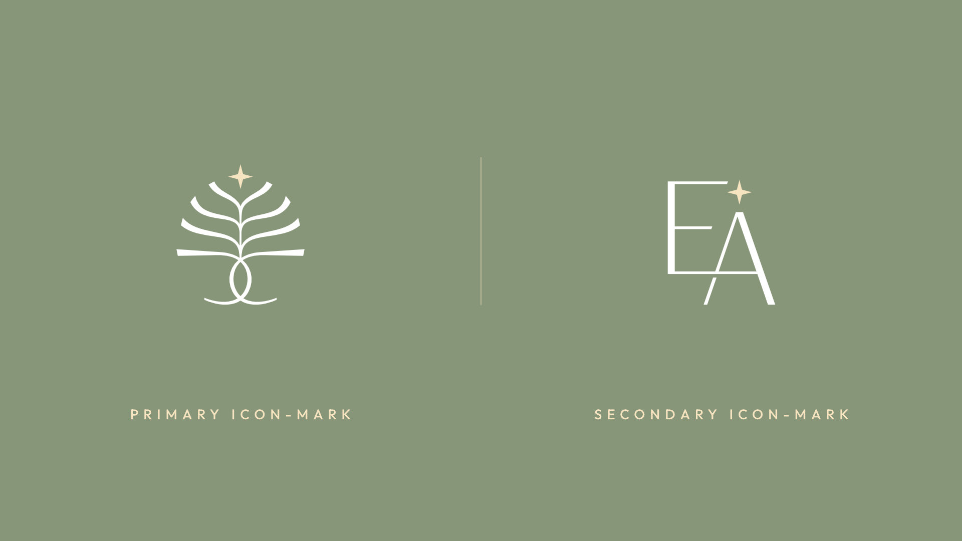
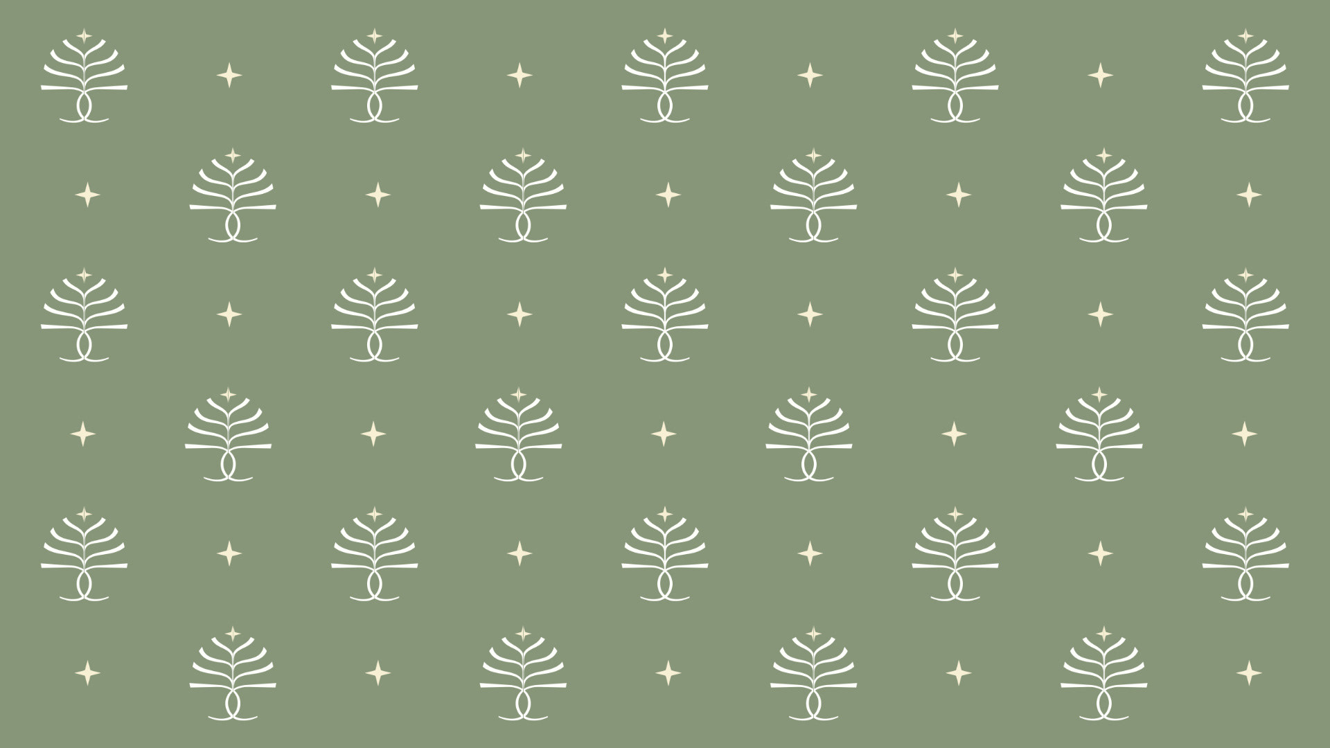
A secondary logo was designed to introduce variety while maintaining consistency, incorporating the same star element from the original logo. It is used in contexts where the audience is already familiar with the brand. To avoid overwhelming customers with excessive use of the primary logo, this alternative version is applied in more subtle placements, such as footers, social media, tissue papers, pillows, and other soft branding elements.
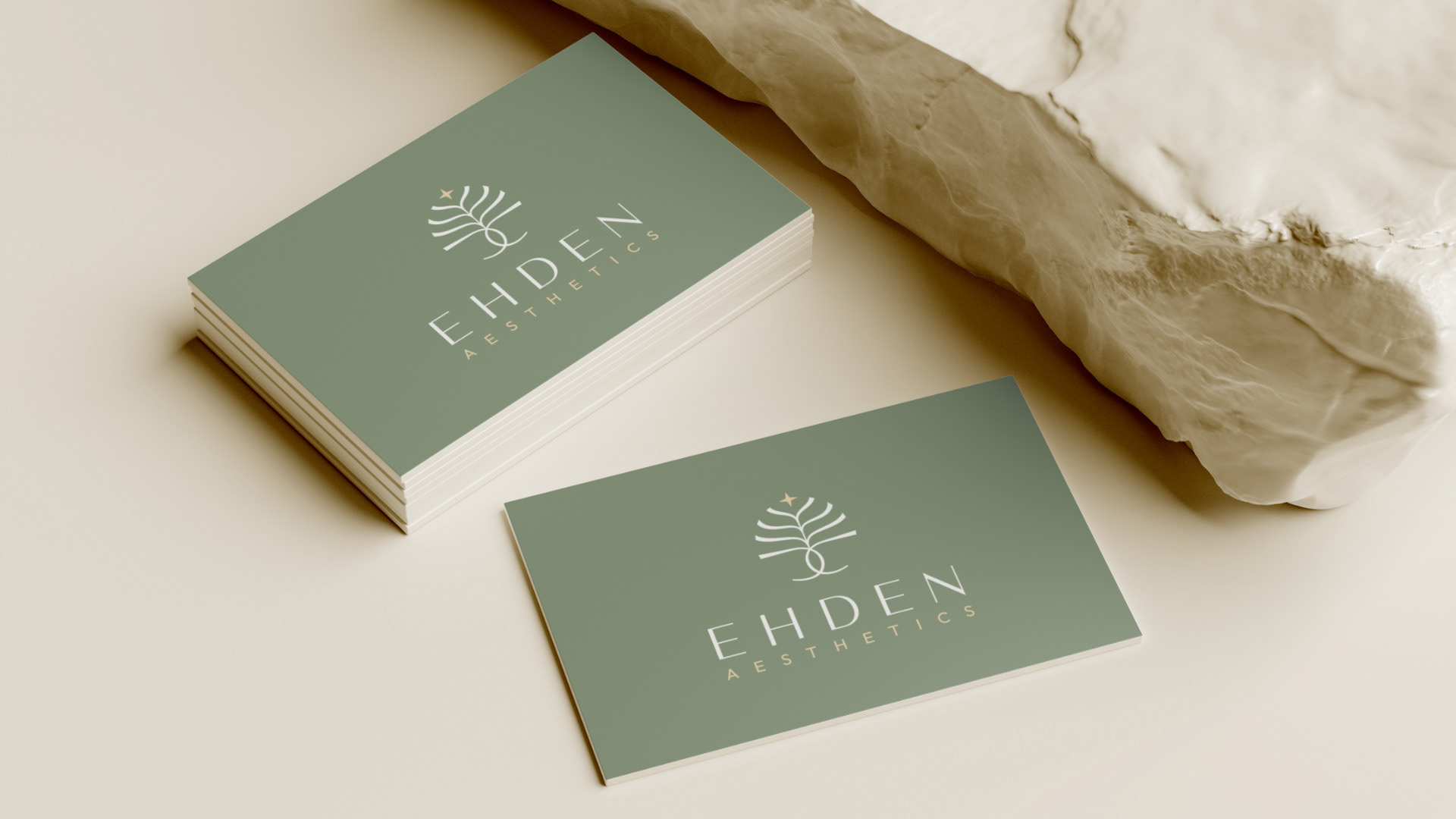
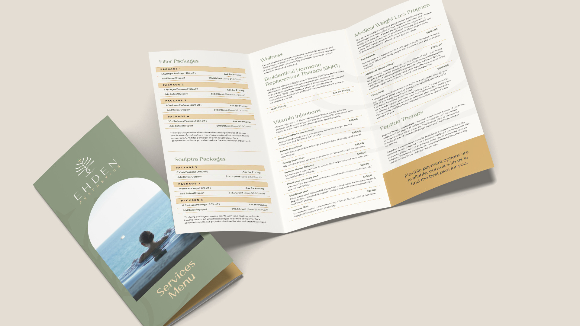
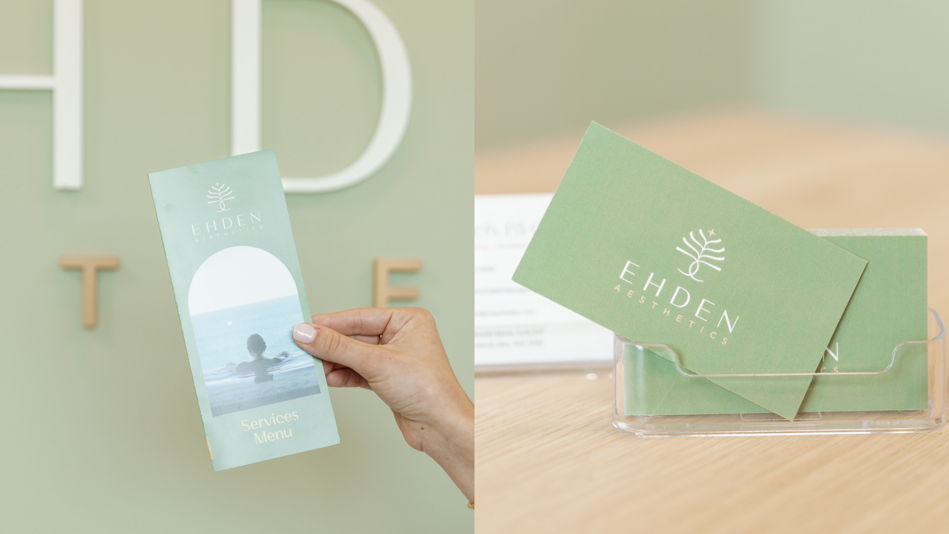
Marketing Materials:
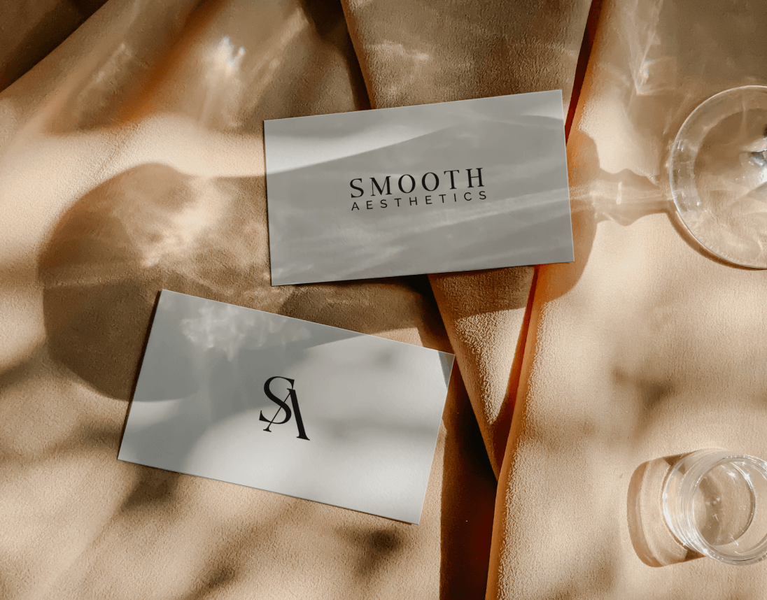
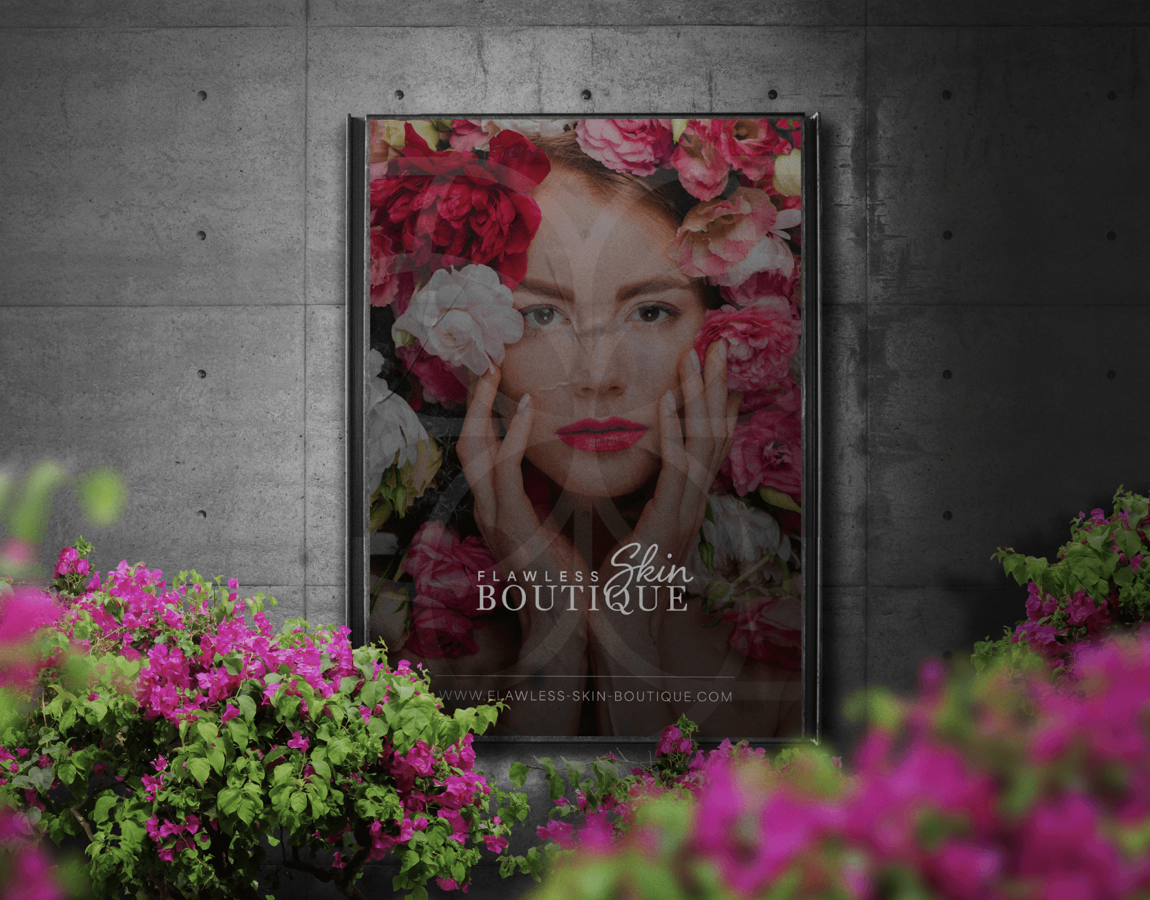
Business cards and brochures were designed with a minimalist aesthetic, mirroring the brand’s clean and sophisticated identity. Every element—down to the layout and material choice—reflected the clinic’s calming yet premium feel.
Business cards and brochures were designed with a minimalist aesthetic, mirroring the brand’s clean and sophisticated identity. Every element—down to the layout and material choice—reflected the clinic’s calming yet premium feel.
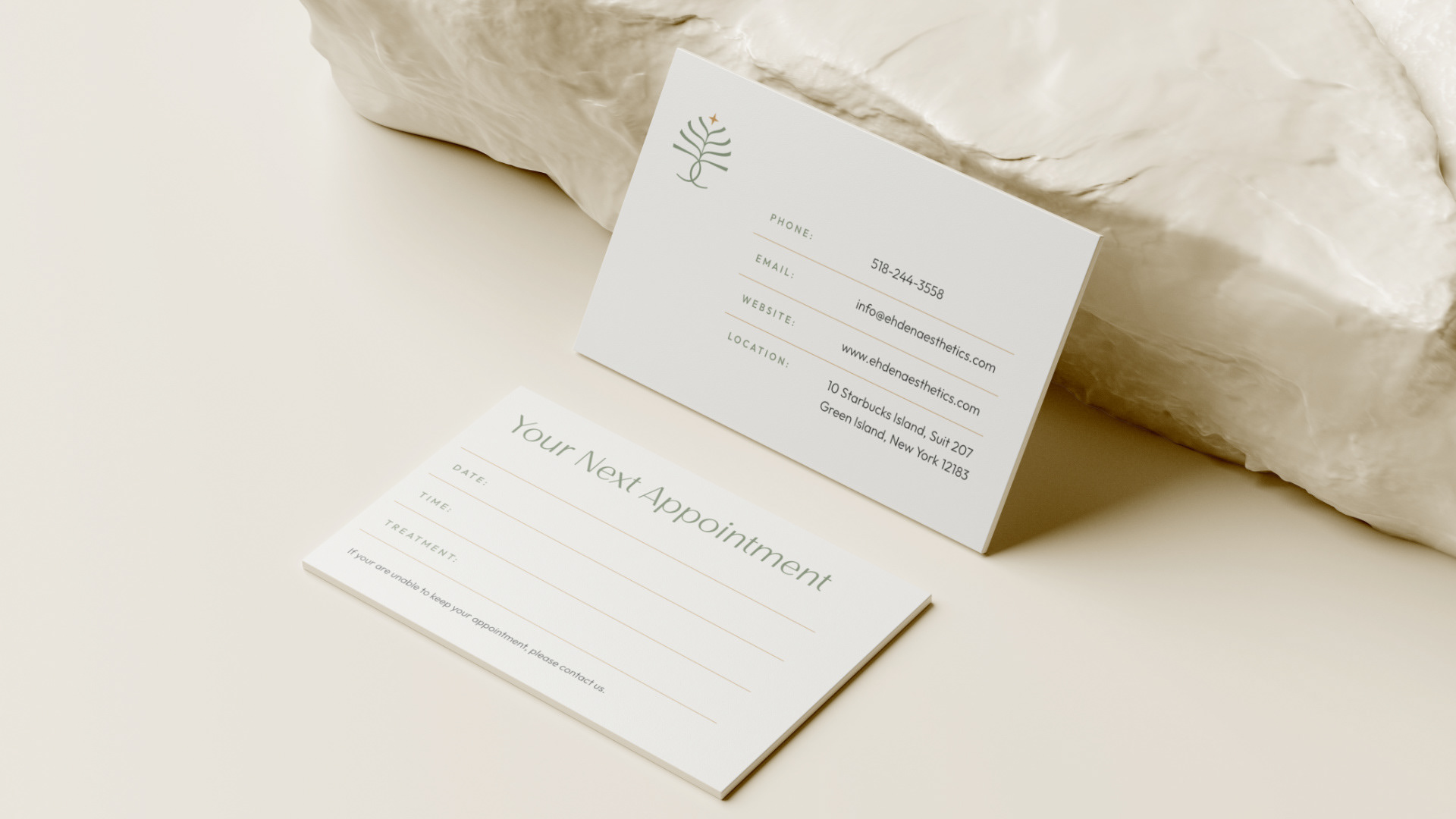
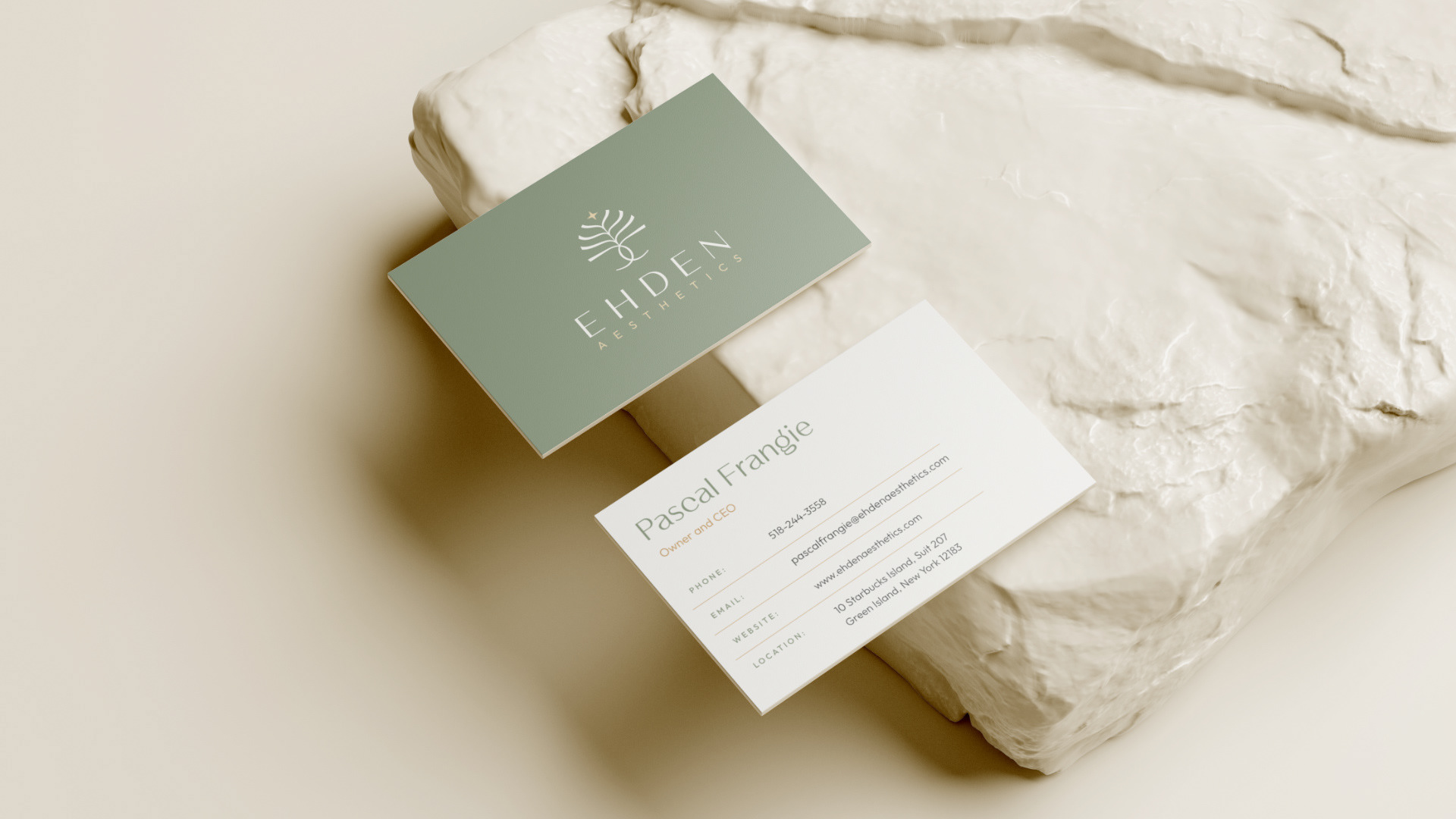
Comprehensive brand guidelines developed to ensure every detail is clearly explained. These guidelines serve as a reference for anyone working with the brand, ensuring that the rules are followed and the brand identity remains consistent across all touchpoints.
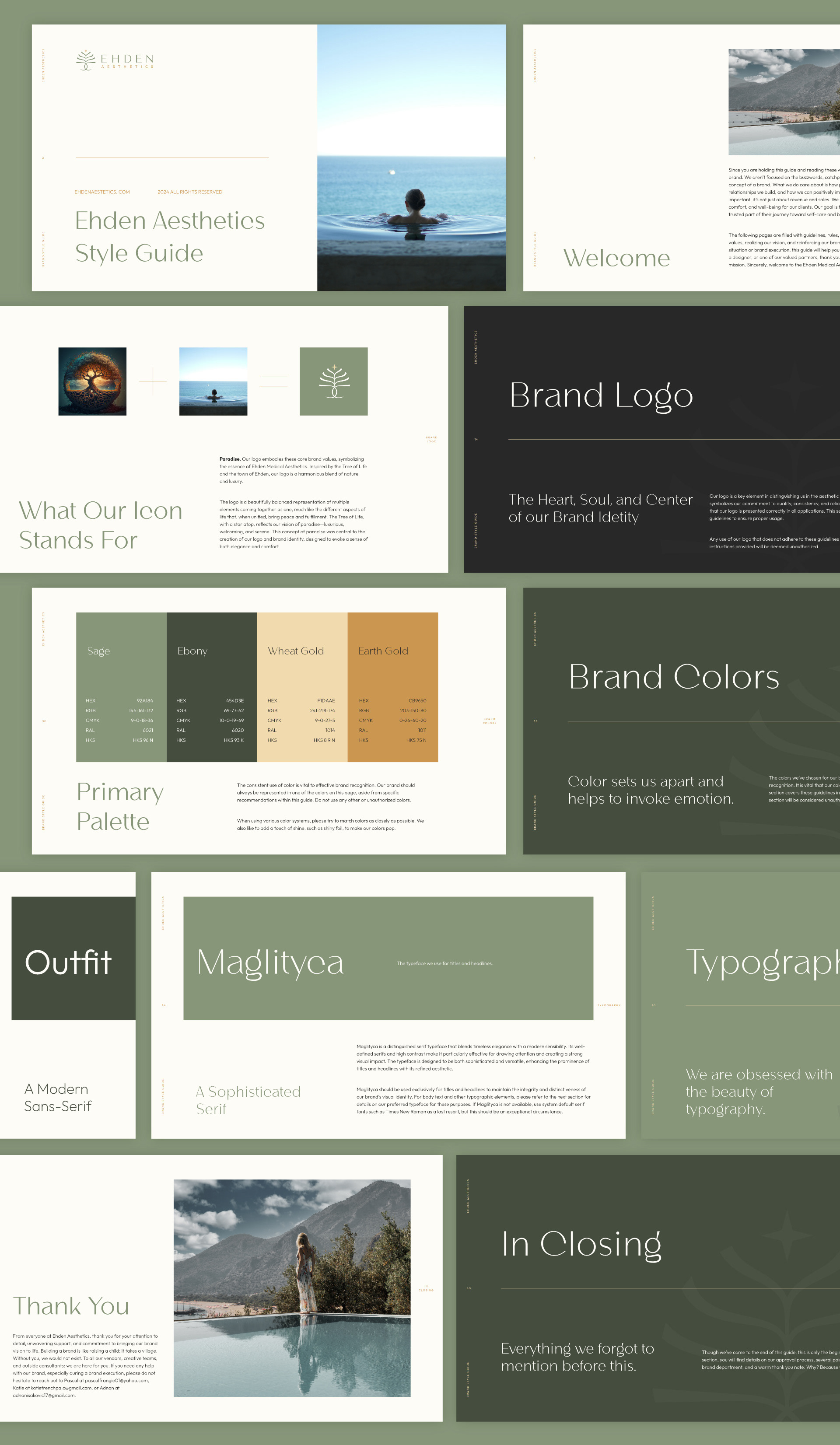
Typography & Colors:
The typography was carefully chosen to balance luxury and simplicity:
The typography was carefully chosen to balance luxury and simplicity:
Headlines: A clean, elegant font to convey sophistication.
Body Text: A geometric font that pairs seamlessly, ensuring clarity and harmony across all materials.
Body Text: A geometric font that pairs seamlessly, ensuring clarity and harmony across all materials.
The color palette was crafted to support the brand’s serene identity, blending soft, neutral tones that evoke peace and well-being.
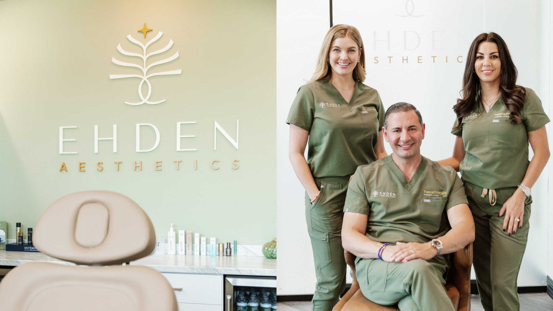
Office Renovation & Branding Integration:
The Ehden Aesthetics office is currently undergoing renovations to fully align with the new brand identity. The interior will feature matching walls, furniture, and décor to reflect the brand’s tranquil, luxurious atmosphere, with the temporary office already incorporating elements of the updated branding.
The Ehden Aesthetics office is currently undergoing renovations to fully align with the new brand identity. The interior will feature matching walls, furniture, and décor to reflect the brand’s tranquil, luxurious atmosphere, with the temporary office already incorporating elements of the updated branding.